Anatomy of a travel map
Something I’ve wanted for a long time is a map showing places I’ve traveled, additionally with some (hopefully) interesting metadata visualized as well.
In the past, I would have considered something like Mapbox raster tiles using Mapbox.js combined with some GeoJSON describing the travel and the metadata.
At best, this would result in a high-fidelity base map overlaid with lower-fidelity regions such as this GeoJSON file of Delaware. At worst, maybe I would put a marker on the map at the center of each visited region, without any region highlighting at all.
But what I was really looking for was something unique, more interactive, higher fidelity, and with a little less overhead to maintain and edit going forward as my travels inevitably continue. The ideal scenario would be to have a small JSON data file with place names, visit dates, and optional notes for display — the absolute minimum amount of custom data to create such a map.
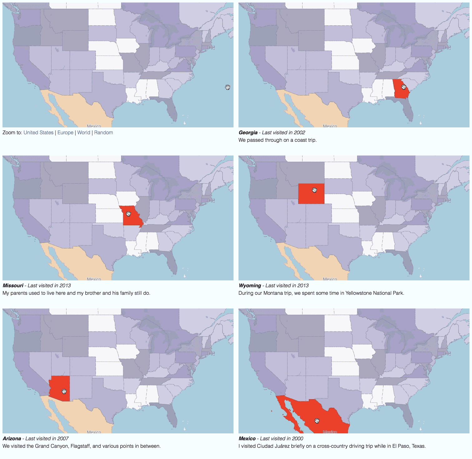
That’s exactly what I’ve put together on my new travel map. You can see this bare minimum data in visited.json, which is what I update as my travels change.
In this post, I’d like to tell you a bit about how I made the project.
Mapbox GL
The base technology is Mapbox GL, which is an in-development, OpenGL-based map rendering library. I usually work mostly on development of the iOS version, so playing with the JavaScript version was a new exploration.
Note that as of October 2016, I have updated the live map substantially from Mapbox GL v0.5.2 to v0.26.0. Some of the info below is no longer accurate, but I will be making a new post soon with more details as well as some info on venturing into native iOS territory. Stay tuned!
The reasons I picked Mapbox GL were:
-
The ability to preprocess high-fidelity travel regions into vector tiles for the lightest-weight transfer to the client app.
-
The ability to modify potentially the entire map style rapidly on the fly in response to user actions.
-
To brush up on my JavaScript hacking skills.
Source data
If you’re not a geodata geek, this part may be the trickiest.
If you like, you can just use my data hosted on Mapbox if you are replicating this project. The map ID for the countries data is justin.d6fe2f0a and for the states & provinces is justin.ceee0bde. Read on if you’d like to understand the creation of this data a bit more, or skip down to the next sections about creating the vector tiles, styling the map, and writing the code.
A suitable high-fidelity data source for country and state/province borders is the excellent Natural Earth project. I used the medium scale cultural data sets (meaning, man-made boundaries) as the source data.
These two data files are distributed in Shapefile format, which means that they are vectors but that they aren’t ideal for use in browser JavaScript since they are relatively heavyweight and binary. But you can preview them in a free app like QGIS (caveat: not known for user friendliness).

At first, I didn’t do any cleanup of the data, since Mapbox GL has the concept of filters that can operate on subsets of the data for styling purposes. But later, just to make things a little easier to explore and to help with overall performance, I used QGIS and the Table Manager plugin to remove the data fields that I didn’t care about. In the future, I can always re-import the Shapefiles and remove fewer fields if I ever need them and, since they are only added, they won’t affect any existing code. You can think of the Shapefile like a database table where I am removing some of the columns in the table.

In the case of countries, I kept the name column (lowercasing it) and for the states & provinces, I kept name, postal (e.g., NY, for possible future use), admin (the containing country name), gn_name (more on this later), and iso_a2 (the containing country’s ISO 3166 two-letter code for easier reference).
Once the data was edited, I could see a much cleaner query result in QGIS.

Vector tiles
As opposed to Shapefile or GeoJSON data, which is arbitrarily geographic in nature, you can think of vector tiles as precut, multi-scale squares of layer data in the Spherical Mercator projection, which is what is used by most web and mobile mapping libraries. Each tile contains a list of layers (e.g., rivers, borders, or street names) along with features projected onto a square grid, sort of like a piece of graph paper. To render such a tile, the software can address certain layers’ features, then “connect the dots” in the grid to draw the features. It doesn’t have to know anything about geography per se, so it can focus on all-out rendering for the most part in order to produce a visual product.
I used Mapbox Studio to create vector tile sources out of the Shapefiles mentioned above, as well as to upload them to my Mapbox account and give them auto-generated map IDs.
Take a look at the Mapbox Studio Source Quickstart.
Don’t worry about anything related to styling in Mapbox Studio, as we’re just using the app as a data converter right now. We’ll use Mapbox GL for styling instead.
I was able to see my data fields (pared down in QGIS above) right in Studio for previewing, ensuring that the data had been turned into vector tiles ready for styling in JavaScript.
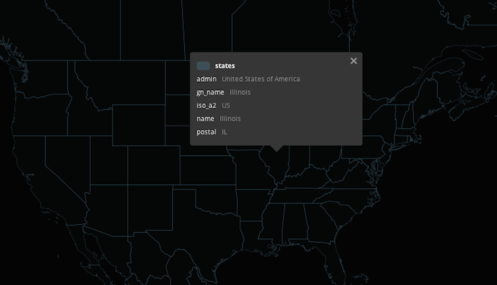
If you’d like to download my Mapbox Studio source projects for further inspection, including the original Shapefiles bundled with them, you can grab countries.tm2source.zip (5.4MB) or states.tm2source.zip (14.7MB).
Map styling
Setting aside the interactive parts of the map right now (which I did in code), I needed a basic map style as a sort of canvas to work on. You can check out the complete style.json, the Mapbox GL Style Reference, or a set of example styles. I used basic-v6.json as a starting point.
I’ll walk through my customizations below.
Colors
I used ColorBrewer for map color advice, choosing rgb(247,247,247) for empty land, rgb(241,163,64) for countries, and rgb(153,142,195) for US states and Canadian provinces. I kept basic-v6.json’s default water color of #a0cfdf.
Constants
I applied my land color and removed some unneeded definitions for things that I wasn’t going to style like @park, @building, and those constants beginning with @road-.
"constants": {
  "@name": "{name_en}",
  "@sans": "Open Sans Regular, Arial Unicode MS Regular",
  "@sans_md": "Open Sans Semibold, Arial Unicode MS Bold",
  "@sans_bd": "Open Sans Bold, Arial Unicode MS Bold",
  "@land": "rgb(247,247,247)",
  "@water": "#a0cfdf",
  "@label": "#666",
  "@label-halo": "rgba(255,255,255,0.75)"
}
Compare to the basic-v6.json original version.
Sources
Here is where I combined the default Mapbox vector tiles auto-updated from OpenStreetMap with my custom data sources created above. This lets me use OSM for the base canvas along with my custom country and state/province regions for layering atop.
"sources": {
  "mapbox": {
    "type": "vector",
    "url": "mapbox://mapbox.mapbox-streets-v6-dev",
    "maxZoom": 15
  },
  "countries": {
    "type": "vector",
    "url": "mapbox://justin.d6fe2f0a",
    "maxZoom": 6
  },
  "states": {
    "type": "vector",
    "url": "mapbox://justin.ceee0bde",
    "maxZoom": 6
  }
}
Layers
The layers section is where I target specific slices of the data for styling purposes. These can be layers that already exist in the sources wholesale or you can use filter sections to further qualify the data. For example, Mapbox’s vector tiles contain the #building layer representing building outlines (which I don’t use in this particular map), but I could further qualify by any property within that layer to only render certain buildings or to render certain buildings differently from the general building styling.
My layers section is a little long to include here, but the main ways that it differs from the basic-v6.json defaults are:
-
I’ve removed layers beginning with
landuse_,tunnel_,road_, andbridge_as I don’t want to show these things. -
I’ve removed the
building,place_label_other, andpoi_labellayers for the same reason. -
I’ve added one custom layer referencing my states/provinces
sourcein order to draw boundaries only in the United States and Canada since this data isn’t included in OSM:
{
  "id": "admin_states_provinces",
  "type": "line",
  "source": "states",
  "source-layer": "states",
  "filter": ["any", ["==", "iso_a2", "US"], ["==", "iso_a2", "CA"]],
  "layout": {
    "line-join": "round"
  },
  "minzoom": 2,
  "paint": {
    "line-color": "#8b8a8a",
    "line-dasharray": [10, 3],
    "line-width": 0.5
  }
}
Code
Now the fun part — the HTML, CSS, and JavaScript that styles the visited areas based on the visited.json data and that responds to user interaction. You can see all of the code in the HTML source to the travel page.
First, I include Mapbox GL in the page <head> section.
<script src='https://api.tiles.mapbox.com/mapbox-gl-js/v0.5.2/mapbox-gl.js'></script>
<link href='https://api.tiles.mapbox.com/mapbox-gl-js/v0.5.2/mapbox-gl.css' rel='stylesheet' />
Next, I setup <div> objects for both the map and the info callout just below it.
<style>
#info {
    width: 100%;
    height: 100px;
    overflow: auto;
    background: rgba(255, 255, 255, 0);
    margin-top: 5px;
}
</style>

<div id="map" style="width: 100%; height: 400px;"></div>

<div id='info'></div>
I setup the routine and data for letting the user click to zoom to various areas of the map.
var worldBounds = [[-55, -180], [75, 180]];
var usBounds = [[23.91, -127.24], [49.92, -64.83]];
var europeBounds = [[34.26, -39.60], [68.25, 70.09]];

[...]

function jumpToBounds(bounds) {
    map.fitBounds(bounds);
    return false;
}
I use Mapbox GL’s map state setters like fitBounds() in order to smoothly animate the changes.
There are a few small items to get things started:
-
The
mapboxgl.accessTokenis set to bill against the right Mapbox account (see access tokens). -
Support for Mapbox GL is checked with
mapboxgl.util.supported()in order to show a text message on unsupported browsers. -
A couple nested
mapboxgl.util.getJSON()calls are used to fetch thevisited.jsonandstyle.jsonthat we’ve talked about above, allowing the map setup to proceed once those have been acquired.
There are two main bits of functionality left to discuss — styling regions based on visit data, and responding to user actions in order to highlight a particular region.
Styling visited regions
The general process for styling regions dynamically is:
-
Iterate the fetched
visited.jsondata forcountriesandstates. -
Choose a styling color based on type (country or state) and an opacity based on the
lastyear of visit property in the data. -
Create a style
layerobject with those properties that is uniquely addressable by the region’s name for later interactivity. This layer will use a custom class which turns the regionredwhen applied. -
Insert each
layerinto the globalstyleobject before applying it as a whole to the map.
The steps look like this for countries:
visited.countries.forEach(function(country) {
    var id = country.name.replace(' ', '-').toLowerCase();
    var countryLayer = {
        "id": id,
        "type": "fill",
        "source": "countries",
        "source-layer": "countries",
        "filter": ["==", "name", country.name],
        "paint": {
            "fill-color": "rgba(241,163,64," + alphaForYear(country.last) + ")"
        },
        "interactive": true
    };
    countryLayer["paint.selected-" + id] = {
        "fill-color": "red"
    };
    style.layers.splice(3, 0, countryLayer);
});
Note that I:
-
Make each layer
interactive. -
Insert each layer at
layersindex3in the style so that they all fall abovewaterand belowadmin_countryandadmin_states_provincesborder lines. The order amongst these custom layers doesn’t matter because none of them overlap. -
Create a custom alternate class definition for each layer that follows the naming pattern
paint.selected-france. -
Call out to a function to determine the color alpha based on visit age on a scale of
0to10years, which leaves a max alpha of0.9and a min of0.4.
function alphaForYear(year) {
    return 0.9 - (0.5 * Math.min(1, ((new Date().getFullYear() - year) / 10)));
}
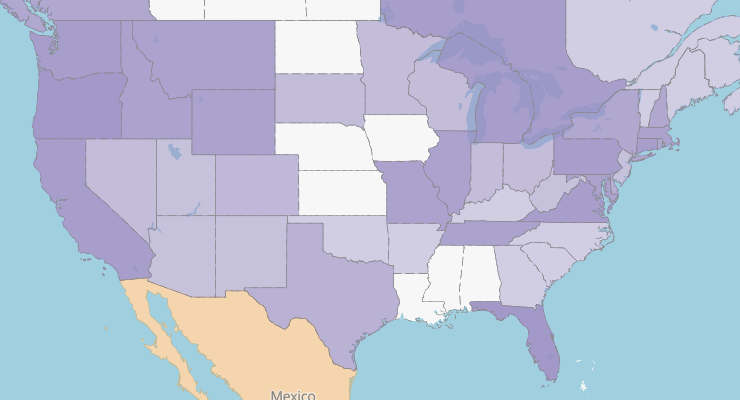
I do the same for visited.states as well, producing a nice, shaded map:
Responding to user actions
The most exciting part of the whole project is the ability to highlight features during hover events, not just showing relevant info, but actually changing the map styling on the fly. This is the true win with OpenGL-based vector rendering in the client; the ability to change the map experience based on user input while using the application.
Since each region layer has a custom class that it can be styled by (e.g., selected-france), we just need to figure out what the user is pointing at. Enter Mapbox GL’s hover() event and the featuresAt() query.
map.on('hover', function(e) {
    map.featuresAt(e.point, {}, function(err, features) {
First, we deselect any currently selected region, whether we’re going to select a new one or we’re in a “dead zone” on the map that won’t select anything.
map.style.getClassList().forEach(function(className) {
    map.style.removeClass(className);
});
Then, if we have a feature hit, choose the first (since we’re not specifying a query radius and we know that our regions are mutually exclusive), get its name, and do a lookup (using a small Array.filter() wrapper) against visited.json to get the properties like the last visit date and the travel notes. (See the closing notes in this post for more info about gn_name vs. name.)
if (features[0]) {
    var placeName = features[0].properties["gn_name"] || features[0].properties["name"];
    var region = regionNamed(placeName);
    if (features[0].properties["admin"] == "Canada") {
        placeName += ", Canada";
    }
    var info = '<em><strong>' + placeName + '</strong>';
    info += ' - Last visited in ' + region.last + '</em><br/>';
    info += region.notes;
Lastly, update the callout below the map with the details and activate this layer’s uniquely-addressable red styling class.
document.getElementById('info').innerHTML = info;
map.style.addClass("selected-" + features[0].layer.id);
If we aren’t hovering over a visited region, revert the callout info. We’ve already deselected any previously selected region above.
} else {
    document.getElementById('info').innerHTML = defaultInfo;
}
The final interactivity looks like this:

Closing notes
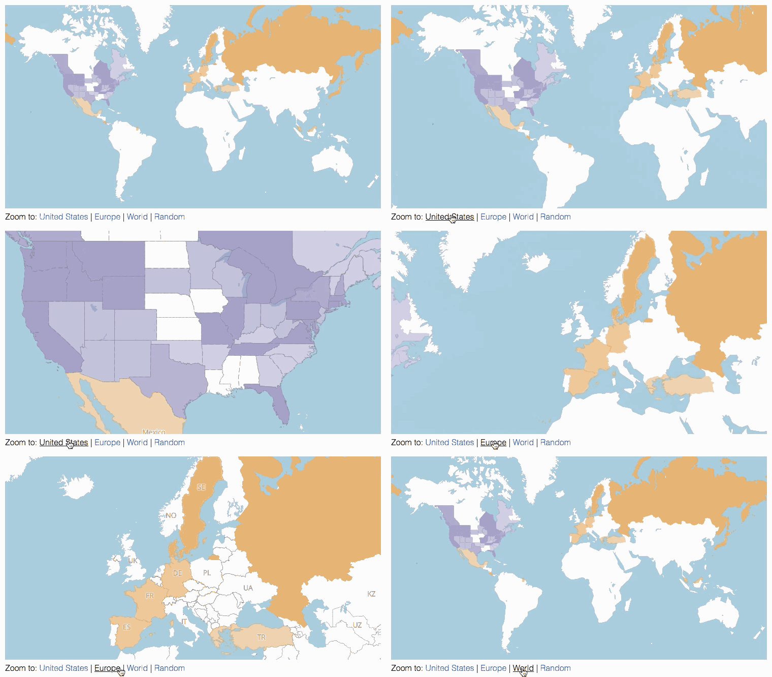
Click-based zoom
The user can click some links in the default callout text in order to zoom to a few predefined world regions. This is accomplished with the abovementioned jumpToBounds() function and some hardcoded latitude & longitude regions for the areas that were obtained by trial & error.
The jumpToRandom() action
One thing I wanted to provide on the map was the ability to jump to a random visited region, both for interestingness as well as to hint at the interactivity of the map in case it was missed.
The process would go something like this:
-
Choose a random number
Nand pull theNthitem fromvisitedormap.style.layersin order to choose a feature. -
Get the geographic bounds of the region.
-
Zoom to the bounds.
However, as mentioned above, conversion of source data to vector tiles strips away any inherent geographic info such as bounds associated with a region. A region is nothing more than dots on a piece of graph paper sliced into adjacent tiles in three dimensions.
My first idea was to somehow encode or preserve the geographic info in the tile feature properties, but this felt messy, difficult, and error-prone.
My next idea was to possibly make use of the currently-discarded wikipedia URL field from the source data to do a lookup against Wikipedia’s API for geographic bounds, but this too felt hacky and brittle.
I settled on the idea of using the Mapbox geocoder to query for the bounding box of a given place name. The query URL would be simple, like this:
var geocoderURL  = 'https://api.tiles.mapbox.com/v4/geocode/mapbox.places/';
    geocoderURL += place.name + '.json?access_token=' + mapboxgl.accessToken;
A random place name could be picked out of the visit data, then the geocoder response could be parsed for result.features[0].bbox and massaged into map.fitBounds() in order to zoom the map to that region. It works pretty well!
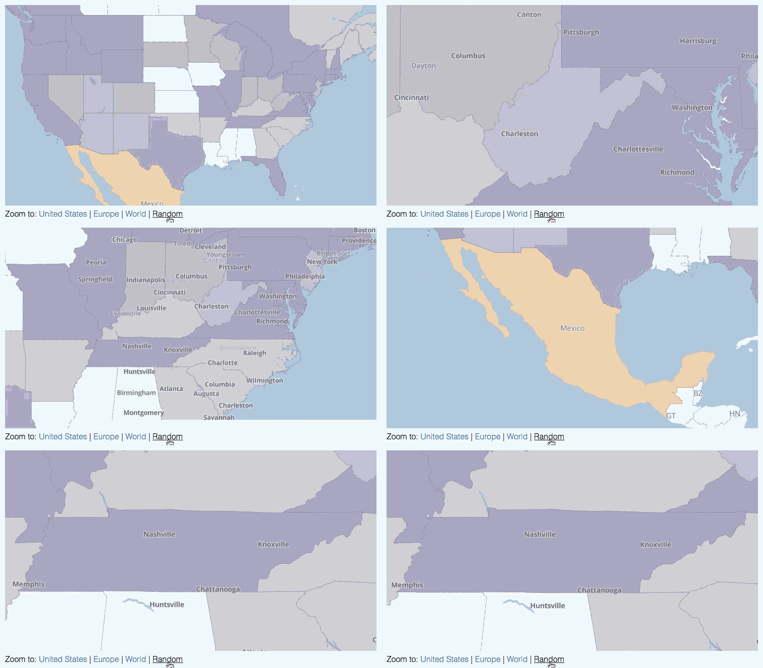
The complete code looks like this:
function jumpToRandom() {
    var places = visitedPlaces[(Math.floor(Math.random() * 2) ? "states" : "countries")];
    var place = places[Math.floor(Math.random() * places.length)];

    var geocoderURL  = 'https://api.tiles.mapbox.com/v4/geocode/mapbox.places/';
        geocoderURL += place.name + '.json?access_token=' + mapboxgl.accessToken;

    mapboxgl.util.getJSON(geocoderURL, function(err, result) {
        var bbox = result.features[0].bbox;
        if (bbox && bbox.length == 4) {
            map.fitBounds([[bbox[1], bbox[0]], [bbox[3], bbox[2]]], { padding: 20 });
        }
    });
    return false;
}
The name vs. gn_name layer properties
One little gotcha I ran into involved the only visited region in my list to include UTF-8 characters, Québec. Something seems to be happening in the Mapbox Studio vector tile creation phase of things, though I didn’t have time to figure out if it’s an encoding problem, a display problem, or possibly both.
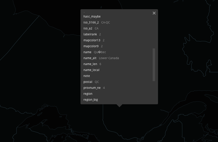
Instead, I passed through the source Shapefile gn_name field, which is the same as name but stripped of any UTF-8 characters. While the Canadian half of me laments the loss of é for now, I’ll try to fix this before travel to too many more places that might cause bigger problems.
Future plans
Some future things that I’d like to consider doing with my travel map include:
-
Fix the abovementioned UTF-8 issues.
-
Highlight the randomly jumped-to area for the user (trickier than it sounds).
-
Add markers to the map for visited cities.
-
Show great circles on the map for flights taken and roads driven like Coleman McCormick’s travel map does.
-
Port the whole thing to Mapbox GL for iOS once some of that platform’s API is fleshed out such as
featuresAt(),fitToBounds(), and dynamic styling.
Stay tuned for future posts if I end up doing any of these things, but for now, thanks for reading and happy hacking — and travels!
See also Anand Thakker’s alternative approach to dynamic hover styling.
Changes:
- Jan 21, 2015: Added a duplicate animated GIF to the top of the post to better surface what the final project looks like.
- Sep 29, 2015: Added a link to Anand Thakker.
- Oct 24, 2016: Added a note about a substantial Mapbox GL version update and updated the iOS project links.